Q&A with Dr. Melania Cristescu
With pipette tip boxes that disappointingly never fill themselves, failed polymerase chain reactions, and gel images that can feel an awful lot like taking a Rorschach inkblot test, generating genomic data is difficult work. Then conveying such patterns into visuals can be even trickier!
In this Q&A with Dr. Melania Cristescu, Co-Editor of Genome and previous judge for the Visualizing Science Contest, we get an insider’s take on what makes for an effective visualization of genomic data.
What drew you to the field of genomics?
The field of genomics is particularly intriguing because it allows us to decode the book of life. Genomic data can reveal the molecular steps behind key evolutionary innovations, since the origin of life on Earth. We can imagine genomics as a time machine that allows us to go back in time and reveal the most important steps that shaped the life history on this planet. It also allows us to make advancements in medicine, agriculture, and environmental science.
What is your all-time favourite visualization of genomic data?
This is a difficult question. Over the years I [have come] across many inspiring visuals but if I have to choose one particular visual, I would have to go back to one early representation of the human genome project; the cover of Nature when the human genome was sequenced in 2001 is one that I’ve found inspirational.
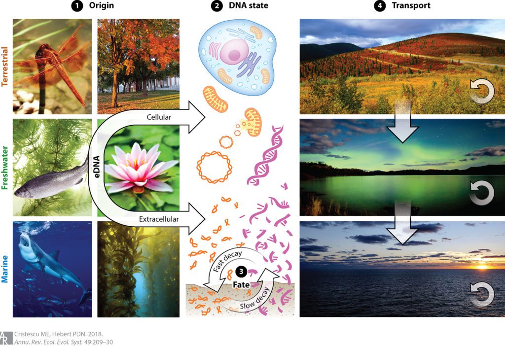
You are known for your work on ecological genomics. What is the biggest challenge you face trying to visualize genomic patterns?
Translating complex genomic patterns into intuitive visuals is not easy. An effective visual should be understandable and should capture the imagination of a broad audience. Often, such visuals present extracts (snapshots) of complex data sets and reflect underlying trends. And, of course, the elements of visual harmony are also important. A good visual offers a nice blend of accurate data, fair extrapolations, and artistic impressions.