Q&A with Dr. Matt Lato
I learned the hard way about how important accurate visualizations are. Exhibit A: A trail map without any indication of elevation or warning of overgrown trails. Exhibit B: My friend and I scaling a cliff to find our way back to what resembled a path, only to slip down a mossy hill and quite literally stumble upon our exit.
Closing remarks: Whether it’s getting lost in the wild or getting lost in scientific literature, visualizations should help us to find our way.
Dr. Matt Lato is a senior engineer at BGC Engineering where he uses visualizations to communicate complex engineering situations and solutions pertaining to the physical environment. In this Q&A find inspiration for your engineering imagery to submit to the Visualizing Science Contest.
What is the biggest challenge you face when communicating about the physical environment? How do you navigate this challenge?
Visualizations are a fundamental form of scientific communication that enable engineers to report technical data, information, risks, designs, and recommendations. In geotechnical engineering, communicating the physical environment has many unique challenges, each requiring special care and attention to produce effective visualizations. In my field of geotechnical engineering, I generally find communicating time-dependant change of the physical environment the greatest challenge. These specific challenges require the use of special techniques, such as slope shaded relief imagery of elevation models to represent the three dimensions of the physical environment and colours to represent changes to the physical environment through time.
The use of colour to represent change (or any variable for that matter) in scientific visualizations requires particular care as human colour perception can lead to a distortion of results. For example, in the traditional rainbow colour scale, yellow is the brightest and most strongly attracts the eye; and, the human eye sees more variability in longer wavelength colours such as reds, oranges, and yellows compared to greens which can result in miscommunication of results when results are scaled equally across a rainbow colour spectrum. Thankfully there is lots of research on this topic, and papers such as Fabio et al. (2020) provide excellent advice on how to properly use colour when developing scientific visualizations.
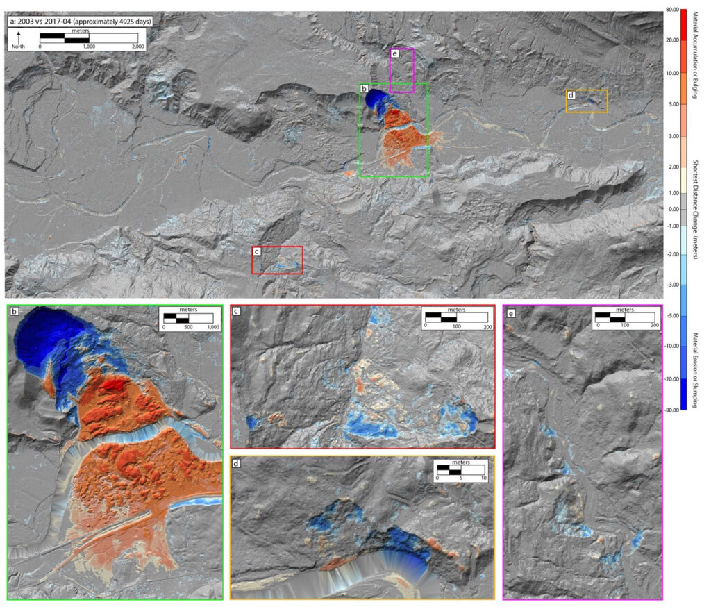
4D lidar change detection analysis of the Oso landslide. The 3D terrain is presented as a hillshade model illustrating the relief and steepness of the terrain; the landslide activity is presented as red-blue colour data overlain on the hillshade. Blue colours, from light to dark represent zones of material loss while reds represent zones of material gain | Courtesy of Matt Lato
You recently published in the Canadian Geotechnical Journal about four-dimensional (4D) techniques. How do you think the use of 4D visualizations can make data more accessible to stakeholders?
The 3-dimensional (3D) physical environment is constantly changing through time (4th dimension) due to natural and anthropogenic activities. Being able to document and understand such changes to the physical environment results in complex 4-dimensional (4D) datasets that can pertain to historical or future changes to the physical environment. Examples of 4D historical change include the movement of a landslide through time captured by high resolution digital elevations models or satellite imagery; while examples of 4D future datasets include the planned excavation of an open pit mine or the construction of a tailings facility. Being able to develop visualizations to support the effective communication of 4D data is challenging, especially when using a 2-dimensional (2D) medium, such as a printed figure, map, or drawing.
To read Dr. Lato’s article in the Canadian Geotechnical Journal, click here
Recent advancements in holographic visualization, known as mixed reality (MR) and augmented reality (AR), are enabling complex 4D environments to be visualized in virtual 3D spaces. Using a 3D medium to communicate 4D data is much easier for someone without technical experience interpreting 2D maps and drawings as the burden of reconstructing the 3D environment from the 2D map is eliminated. This ability helps generate a deeper understanding of complex scenarios amongst technically diverse project teams and stakeholders.
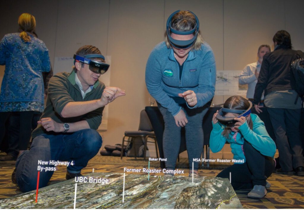
HoloLens mixed reality being used to walk Yellowknife residents through a virtual model of the Giant Mine closure plan at a community forum. All users are able to visualize the same 3D environment and walk around the model. The mode can be virtually moved enabling the users to see the as built underground environment and planned design activities | Courtesy of Matt Lato
What do you think is the most important thing to consider when creating a visualization for an engineering project?
When creating visualizations to support the communication of engineering projects, the first step should always be to understand the audience and their technical knowledge of the subject you are communicating. Once this is established the visualization can be designed to effectively communicate the message to connect with the target audience. When developing the visualization, regardless of the audience’s technical capability, it is important to limit the information presented to the key message of the visualization. The content should be presented in an unambiguous manner, not requiring the audience to refer to other material to comprehend the message presented. Visualizations, paired with a well written caption, should stand alone. Effective visualizations are a powerful way to communicate complex engineering situations and solutions pertaining to the physical environment; their development must incorporate an appreciation of visual-arts, user-experience design, and engineering knowledge.