Samantha Andrews

Marine biologist/ecologist and a science and environmental writer. She can be found talking or writing about our Earth in all its splendour—including the people and other animals who live here —and achieving a more sustainable future.

Elements of Science: What are the elements of a great table?

September 11, 2023 | 5 minute read

How should you present information in your paper? In the body of the manuscript? In a graph? A diagram? A map? An illustration?

When it comes to data, tables are often the go-to choice.

Creating tables may seem like a relatively straightforward affair. However, the construction of a high-quality table is not easy. “I found it very difficult when I first started my career as a researcher,” says Dr. Brian Beres, Editor-in-Chief of the Canadian Journal of Plant Science. “You know the data and results intimately, but that doesn’t mean it’s simple to put them together in a table that readers can easily navigate and understand. Practice really does make the perfect table.”

If you’re looking for some tips to help you create a great table, you’ve come to the right place!

First, ask yourself if a table is needed

“Tables serve a lot of purposes, but I come back to two good reasons for using a table,” says Beres. First, they provide “details or outcomes from the process of hypothesis testing.” Second, “they provide the supporting evidence for the conclusions reached during the synthesis of the data.”

Dr. Wendy Ward, Co-Editor-in-Chief of Applied Physiology, Nutrition, and Metabolism, offers the following advice on when to use a table:

  • Use a table when there are a lot of data to share. Data presented visually in a table are often easier to understand than data embedded in the text. If there are a lot of data to share, a table can also be useful to group specific data for comparison among complementary outcomes and to help explain an overall finding.
  • Use a table when a figure won’t capture the key messages.

In other situations, a table isn’t the best way to display your data. For example:

  • Don’t use a table when there are no significant differences between or among groups such that showing the data in a table will not be helpful.
  • Don’t use a table when the data can be more powerfully displayed in a graph (i.e., if trends in the data reveal more than individual data points.)

Depending on the type of data, it may be best for authors to follow a ‘standard’ table format for their field. Researchers will know what is typical in their discipline, but they should also be mindful of what format is most effective for communicating a specific set of data.

The Canadian Journal of Plant Science focuses on all aspects of plant science relevant to continental climate agriculture.

Make sure your table can stand on its own

“Tables require careful consideration to ensure that appropriate details are included and to ensure that you communicate your science accurately and effectively,” says Ward. “It is crucial that a table can be understood on its own, without reading the text in the results section.”

How do you achieve this? Give details. The table should explain the ‘who,’ ‘what,’ ‘where,’ ‘when,’ and ‘why’ of your experiment.

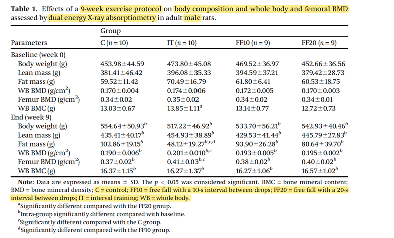
As an example, Ward highlights Table 1 from Boudenot et al.’s 2021 paper “Free-fall landing and interval running have different effects on trabecular bone mass and microarchitecture, serum osteocalcin, biomechanical properties, SOST expression and on osteocyte-related characteristics”:

Dr. Ward says Boudenot et al.’s 2021 Applied Physiology, Nutrition, and Metabolism paper is an example of a great table, thanks to the inclusion of key information (highlighted in yellow) and clear formatting that allow the reader to understand the nature of the study and interpret the results.

There’s a lot to appreciate about this table. The caption (sometimes called the figure title) is descriptive and provides a lot of information about the nature of the experiment and its results:

  • The intervention performed is clearly identified, including what it was—an exercise protocol—and the duration of the protocol (nine weeks).
  • The outcomes included in the table are identified (body composition, and whole body and femoral BMD).
  • How the outcomes were measured is identified (dual energy x-ray absorptiometry).
  • The species (rats) and sex (males) are clearly identified.

The headers clearly identify the sample size for each group. Rather than stating a range such as n=9-10/group, the authors have specified the sample size of each group. The footnotes provide helpful details that assist with interpretation:

  • Abbreviations are defined.
  • Each intervention is explained.
  • The statistical comparisons are clearly stated.
The journal of Applied Physiology, Nutrition, and Metabolism will highlight emerging research on the impact of extreme temperatures on health and performance in this new collection. LEARN MORE

Details, yes. Clutter, no.

While details are necessary, Beres cautions against creating a table that is “a cluttered mess of letters and acronyms only the research team understands.”

Column and row headers should be clearly labelled with each variable and its units. As a result, there’s no need to list every single response variable in the caption or in the footnotes/notes.

When providing statistical results in a table, it’s important to ensure that the meaning of each value is clear to the reader. For example, “if possible, it is always a good idea to combine your ANOVA results with the least-squares means (LS means) summarizing the main effects. This provides the reader with immediate clarity around what is important, what is not, and what any emerging trends might be,” says Beres. As another example, Beres warns that letters aren’t always necessary to summarize the significant differences from a mean separation test. Using too many characters creates confusion rather than clarity; Beres suggests sticking to one or two characters.

Beres highlights Table 6 from Collier et al.’s 2022 paper, “Fall-applied residual herbicides improve broadleaf weed management in ultra-early wheat (Triticum aestivum L.) production systems on the northern Great Plains,” as an example of a table that has a lot of information but that “presents it all in a concise and coherent way that facilitates easy navigation and interpretation.”

Dr. Beres says Collier et al.’s 2022 Canadian Journal of Plant Science paper is an example of an information-heavy table that is clear and concise.

Don’t forget to link the table in the manuscript!

Just because readers should be able to understand a table without constantly referring to the main text doesn’t mean you don’t need to mention the table. “Should every detail in a table be summarized in the body of the manuscript? I suggest not,” says Beres. Instead, use the results or discussion section to highlight the most important observations and their meaning, trend, or implication.

As Beres says, “If you think it is taxing to write about every response variable in your results and discussion sections, just know that it is equally boring to read, so devote that precious real estate to what is really important, and let the table complete the picture.”

Tips, techniques, and expert advice on crafting great scholarly communications can be found in our Elements of Science blog series. Read about the elements of a great map, create a great briefing note, and learn how to write a great title.

Samantha Andrews

Marine biologist/ecologist and a science and environmental writer. She can be found talking or writing about our Earth in all its splendour—including the people and other animals who live here —and achieving a more sustainable future.