Samantha Andrews

Marine biologist/ecologist and a science and environmental writer. She can be found talking or writing about our Earth in all its splendour—including the people and other animals who live here —and achieving a more sustainable future.

Elements of Science: What are the elements of a great map?

March 20, 2023 | 4 minute read

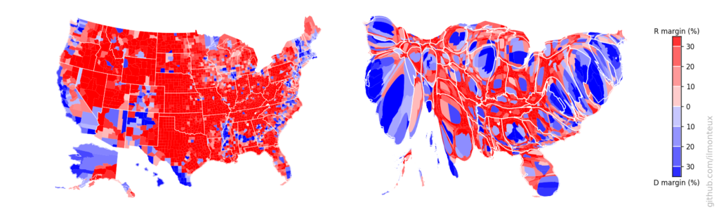
From geography to ecology to epidemiology to sociology and beyond, much of the data we generate has a spatial element – a physical location, distribution patterns, and geographical relationships with other data or variables, for example. The tool of choice for showing those elements? Maps.

“Maps are an extremely useful tool,” says Thomas Herbreteau, Chair of the Canadian Cartographic Association’s Geovisualization and Map Design Special Interest Group. “They can be leveraged to improve your projects, our cities, and our society. They can save lives. They can also visualize a story like no other medium.”

We asked Herbreteau to share his top tips for not just making a good map to communicate your research, but for making a great map.

Ten seconds to communicate

Ideally, “the audience should understand the story the map is visualizing in less than ten seconds,” says Herbreteau. As an example, Herbreteau highlights Peter Atwood’s Shipwrecks of Nova Scotia map, which won the 2022 CCA President’s Prize (College Level).

Freelance cartographer Peter Atwood, created the Shipwrecks of Nova Scotia map while he was studying at the Centre of Geographic Sciences, Nova Scotia Community College.

“Notice how visible the title is,” says Herbreteau. “It’s placed on the top-left corner of the map, and it’s in a bold, black font – two excellent strategies for the reader to quickly understand the goal of the map.”

Then there is the colour scheme. “The reader needs to focus on two other items: the ocean and the shipwrecks. The latter are in black and red, while the ocean is visualized with a darker coastline and a nice fade out of blue from the coastline outward,” explains Herbreteau, noting the earth-tone background.

“During the first ten seconds, you see the title, the coastline and ocean, and black dots representing shipwrecks. That is very effective communication and excellent cartography.”

Consider colour carefully

Colour isn’t just used to make elements stand out. It can also convey information. For example, “when it comes to thematic mapping – which uses colour to visualize statistics for a geographic area – there are different ways to classify the data and many colour scheme options,” says Herbreteau.

A simple visualization may involve using green for low density and red for high density, but we often want to show more details. “How do we slice the data?” asks Herbreteau. “Five shades from green to red? Eight shades? Or just three shades?” Herbreteau recommends taking time to test different visualizations and choosing colourblind-friendly schemes. Thompson et al. (2023) used the Viridis R package to generate colourblind-friendly maps to show predictions of groundfish distribution in British Columbia.

Different map types for different needs

Just as there are multiple types of plots to visualize data, there are multiple types of maps. Bivariate choropleth maps, for example, show the relationship between two different variables, while graduated symbol maps show the distribution of a particular variable.

O’Brien et al. (2023) used bivariate mapping to show the spatial overlap between current density (the probability of animal movement) and carbon forest biomass in Ontario, Canada.

Klinard et al. (2018) used a graduated symbol map to show the distribution of acoustically tagged pumpkinseed (panel a) and bluegill (panel b) sunfish in the Detroit River.

The type of map you choose can have substantial implications for its interpretation. “I cringe every time I see the standard [USA] election results map because it doesn’t reflect the actual results very clearly,” says Herbreteau, explaining that it overrepresents rural counties with lower populations. Instead, Herbreteau would use a cartogram to visualize election results. “It’s a very unique mapping technique that, in this particular case, sizes counties proportionately to their voting population,” Herbreteau explains.


The ‘standard’ USA elections map (left) shows the geographical distribution of votes over the land surface, giving the impression that the US primarily votes Republican (red) and not Democrat (blue). By using a cartogram (right) to map by the number of votes, a very different picture emerges. Credit: Angelo Monteux.

Communicating your research with a great map

Never has an adage more relevant to maps been spoken than “a picture is worth a thousand words.” For researchers considering space and geography, a well-considered map can help communicate findings in a way that isn’t just easily understood, but can create connection and engagement with the public and other scientists alike.

Samantha Andrews

Marine biologist/ecologist and a science and environmental writer. She can be found talking or writing about our Earth in all its splendour—including the people and other animals who live here —and achieving a more sustainable future.